A single stroll through Skagway, Alaska, will make you feel as if you traveled back in time. Nearly everything about the town, from the architecture to the signage to the fascination with gold, seems undisturbed since the days of the Klondike Gold Rush in the late 1890s.
However, Skagway isn't exactly "the town that time forgot," as one friend likes to say. The old-fashioned look is very much intentional and is a result of residents taking their history so seriously. In fact, Skagway has a seven-member commission who oversees and regulates the aesthetics of any new construction projects downtown.
The goal is to make Skagway's storefronts as similar to the ones in pictures like this (click to view entire photo):

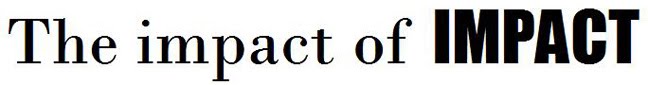
Naturally, typography plays a huge role in putting Skagway in its historical context. Several businesses have their names painted right on the structure as an homage to the past, often resulting in an old-timey handwritten appearance:


Other businesses opt for a printed signs, but compensate with period-appropriate typography. The serifs give the signs a sense of formality. Sans-serif typography can be found in some Gold Rush-era signs, as evidenced in the antique photo above, but the style didn't take off until the 1920s. Signs like these pay tribute to Skagway's olden days:


A few other winners:


The next example is a curious case. The typeface is clearly a modern serif font, marked by a noticeable contrast between thick and thin lines. However, it deserves credit for cramming close to two dozen words into a tiny space à la any newspaper from around the turn of the century. Also, the restaurant serves food from at least three different cultures, so they earned the right to do whatever they want. Take a look:

On the other end of the spectrum, we have this jewelry store, whose name is painted but in an incongruously modern, slick typeface. These slender, sans-serif, immaculately crafted letters stick out like a sore thumb in Skagway.

It's like when you go to an '80s-themed party, and there's always that one guy who isn't in costume. It's not that hard. Just pop your collar. Or in Jewelport's case, beef up your letters and throw some serifs on them.
The owners of the following sign employed period-appropriate typography, and even bordered it with an elegant flourish. But it has light bulbs. Not cool.

Then we have this shit. That's clearly Times New Roman. Which was released in 1931. But you could forget the anachronism. It's Times New Roman. Have a little self-respect, man.

A heads up: The phrase "Days of '98" is not referring to Windows.
There will always be a few party crashers. But the majority of businesses take the theme to heart, helping make Skagway an old-timey typography paradise. I hope it stays that way forever.

No comments:
Post a Comment