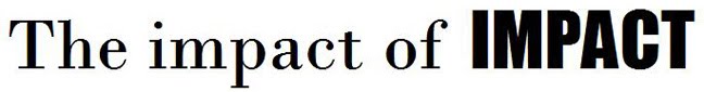

But upon closer inspection, it fails the Impact test. Check out the discrepancies between tampabay.com's typeface (top), and the real Impact:

The big difference is in the width, height and roundedness of the counters, or white spaces, in enclosed or partially enclosed letters like p, b, m and o. Impact's counters are skinnier, taller and rounder than tampabay's typeface. They also differ in their 'a' bowls (the part that sticks out to the left): While Impact's 'a' bowl rigidly lines up with the a's finial, tampabay's curves beyond, coming dangerously close to touching the preceding letter (look how close the 'p' and 'a' in 'tampa' come to grazing each other).
Verdict: Not Impact

No comments:
Post a Comment